Thursday, July 26, 2007
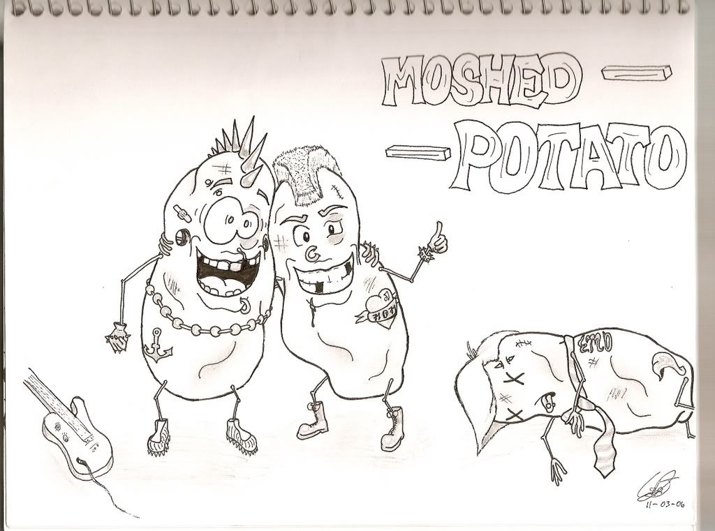
Moshed Potato
I can't believe I haven't posted this yet! This one was for a friend last year. Notice, those emo don't stand a fighing chance against a hardcore spud! He probably got roundhouse kicked in the eye... ba-dump chshhhh... sorry.


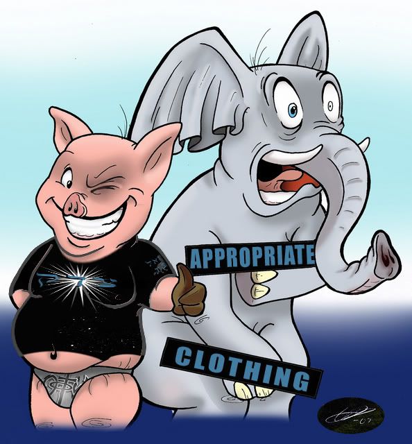
Cleanin' up (PG style)
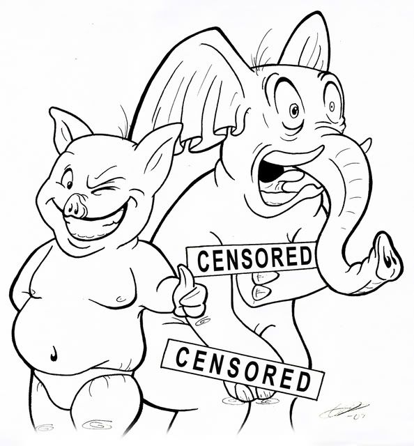
well, if you read my blog, you would've seen the 'controversial' add I did for a pool party with a pig in a NOTW speedo and a naked elephant. Unfortunately, being a pastor in training, the drawing has gotten some negative attention, with comments rolling in sounding something like… “he looks pretty sketchy, you should dress him”, “I don’t think you should have this risqué of a pic on your site”, and “you still owe me 5 bucks!”… psssh, everyone’s a critic. Anyway, I thought I’d go ahead and keep my mom from grounding me somehow and add some fashionable clothes to this piece. (I don’t care how long ago you moved out, they can find a way to ground you well on into your 60’s!) Seeing as how I’ve been selected to do the semester shirt at my college and have recently changed one of the colors, I thought this would be a perfect time for a dual debut! So without further ado...
...that's right!

...that's right!
Wednesday, July 25, 2007
Shirt Design
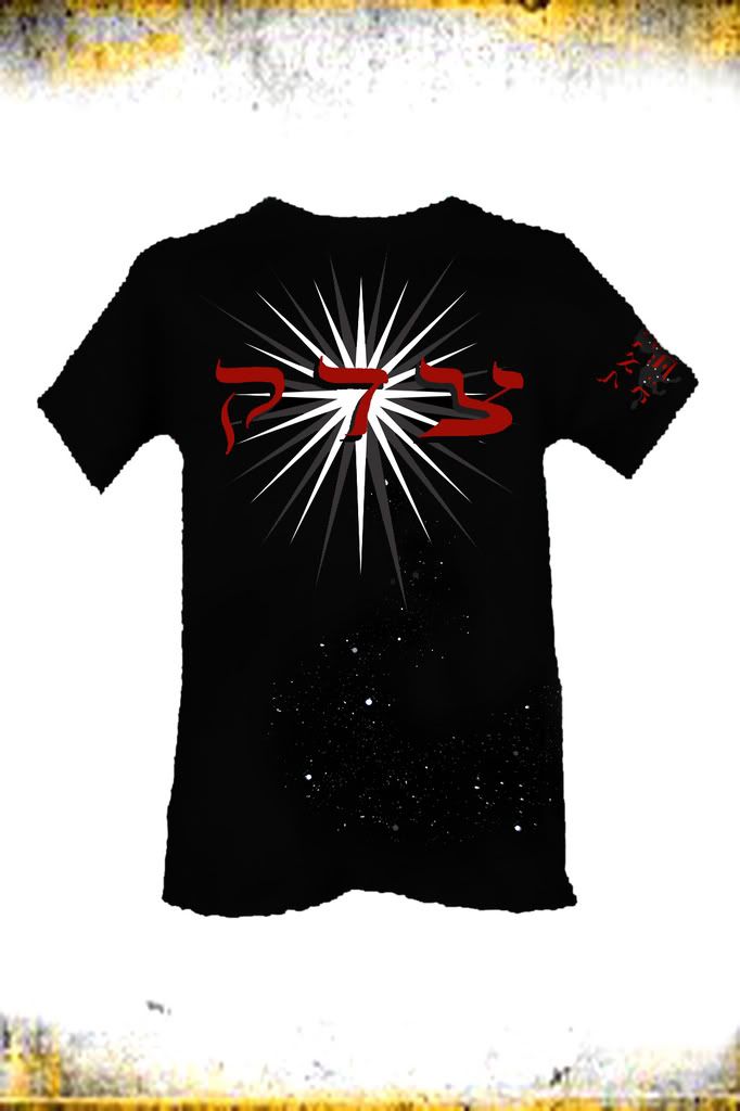
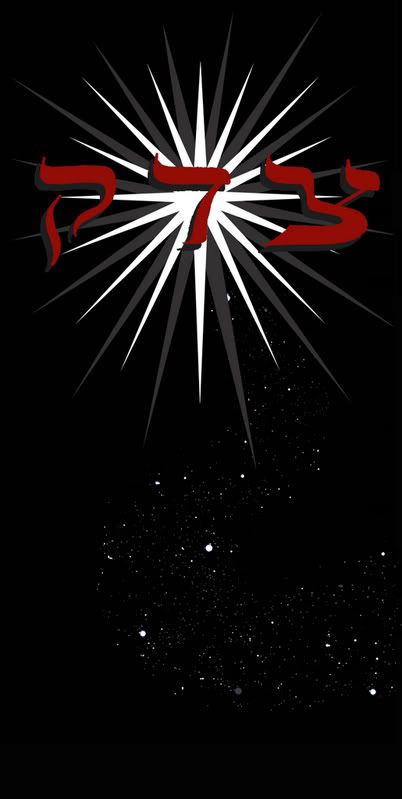
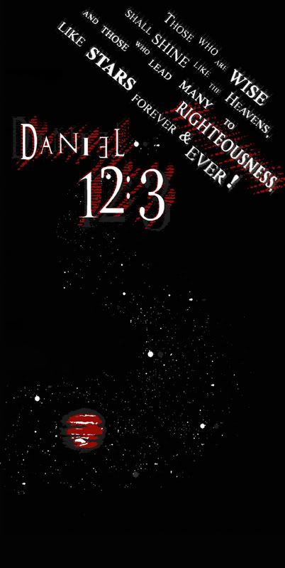
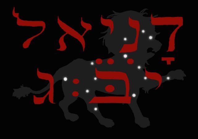
This is a design I submitted for the shirt for my college's next semester. The theme is Daniel 12:3, (a particularly difficult address to remember, phssh 'dan 123') anyway, I looked up the word for righteousness in the original Hebrew and found something rather interesting! The word TSADAQ (which is on the front of the shirt) means not only righteousness but also justice and salvation! It also just so happens to be the word they use for Jupiter, which was perfect for the starry theme of the scripture. Anyway, they may need me to change up the colors a bit, but I’m still constrained to three tones at the max! SUXVILLE! But as long as it gets used for the semester and I get the satisfaction of seeing my design on the entire student body, I’ll be set ;). The sleeve has a pic of the constellation Leo with Daniel 12:3 written in hebrew over it. Oooh, quick lil’ side note, notice how hard it is to draw Jupiter that small with only three tones, it came out looking like a space hamburger!
THE FRONT
THE BACK
THE SLEEVE
Thursday, July 5, 2007
Learning From the BIG BOYS!!!
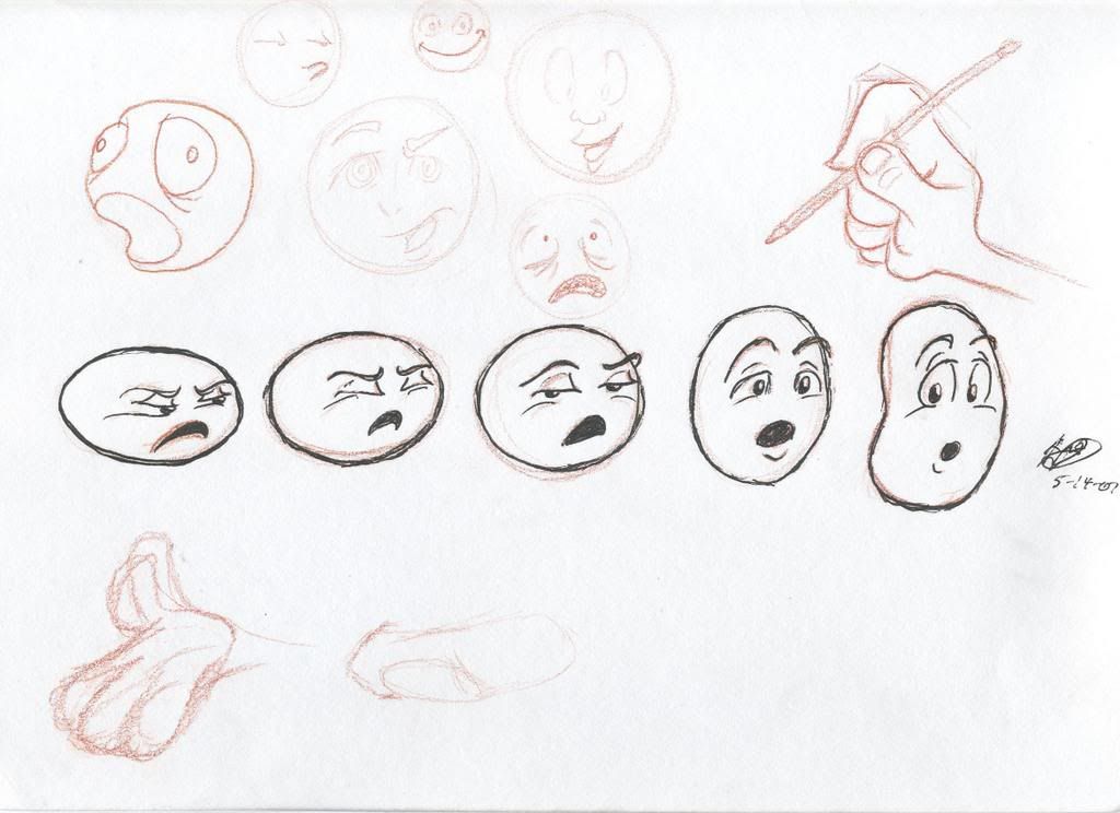
I've been on an animation kick lately, and certain cartoon/broad style artists have been my inspiration of growth with my art. Primarily Shane Lewis, Tom Bancoft, and Harald Siepermann, all of whose blogs I read daily and attempt to mimic their style by attempting some of their more simple works. Of course I’m no where near as good as they are; these are trained professionals with degrees in art and design and I’ve only been drawing regularly for not even a year!
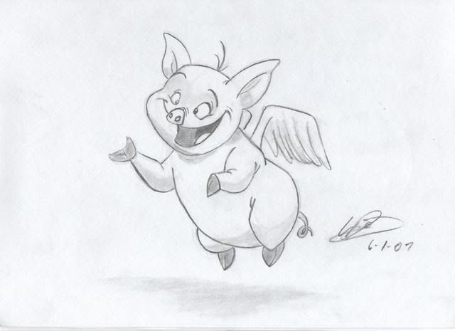
Here’s a flying pig I drew along with Shane Lewis’ instructional video, yeah, I know it doesn’t look exactly like it, but that’s actually a good thing. (please don’t sue me Shane)
You can see I completely jacked his style to do this pig in a flyer for a pool party. The caption above this pic read ‘bring your own swim suit’, (B.Y.O.S.S.) with an arrow pointing to the pig’s speedo saying ‘good’ and arrows pointing to the elephant’s censor bars saying ‘bad’.
Once again I used Shane’s postings to attempt a new endeavor in photoshop. I’ve never digitally colored anything besides all the effects I did in my play poster, I hope I’ve made my teacher proud ;)

Subscribe to:
Comments (Atom)

